Posted by: mallory527 | May 4, 2009

Final Project

Spring in Bloom in Washington D.C.

http://s596.photobucket.com/albums/tt47/mallory527/Spring%20in%20Bloom%20in%20Washington%20DC/?albumview=slideshow

After living in Washington D.C. for four years it is only common knowledge that spring is absolutely beautiful here.  For my photo essay I wanted to capture different angles of different flowers found all over downtown D.C.  The photos were taken on April 17, 2009 at the Smithsonian, the National Mall, and the Tulip Library (which is adjacent to the Tidal Basin).  I went on a day that I knew the lighting would be very bright and tried my best to stay away from shadows and dark lighting. I relied mostly on ambient lighting because I wanted each flower to look natural and not staged in its surroundings.  When taking these pictures I tried to make sure I could present each flower in very bright light as to expose the vividness of each of their colors and complexity of their textures which is why I used no additional devices to block or shadow the sun.  Although using this pure, ambient lighting may sound easy to do, it was much harder than I had expected.  I wound up taking two or three shots of each set of flowers changing the angles, zoom, and height I was standing at (or in some cases laying) in order to capture more color than glare in the shot. I went downtown at a time where the sun was actually directly above me, which helped in some cases but was a pain in others.  Overall, shooting this variety of flowers was fun and really allowed me to experiment with my camera.  I also managed to accomplish some photographic techniques in this photo essay that I was not able to in my first.  I think the new techniques I attempted add more depth and energy to my photos.  What I was really interested in trying was blurring the background while keeping the foreground sharp, which I think I accomplished in several of the photos you will see in this essay. I am actually very pleased with the outcome and will experiment further with angles and different shot techniques in the future.
Posted by: mallory527 | April 16, 2009

The Scream

Painted Video: The Scream…Edvard Munch
Have you ever gotten that feeling that you’re being watched? Or that something bad could happen to you at just about every corner? This was the feeling the young woman with the red purse had one day on campus.  After paying an obscene amount of money for two hours of parking in the Nebraska parking lot, the young woman with the red purse walked onto campus.  She walked diagonally from the lot towards Mary Graydon Center where she began to get the feeling that she was being followed or at the very least, watched.  She shrugs it off as nothing until a lurking person is seen in the background; she only glares then stands to follow the young woman with the red purse into the building.  The lurking girl has a menacing look on her face as she slowly enters the building with nothing but bad intentions streaming through her mind.  The young woman with the red purse loses her fear as she enters MGC, sitting calmly at one of the vacant computers, looking up grades and checking her email.  She is then once again overcome by a strange feeling that someone is watching her every move.  She begins to panic and wonder why could anyone be watching her? What was so different and special about her? Again after looking once or twice over her shoulder the young woman with the red purse logs off and leaves her computer with the strange feeling of being followed still bothering her.  What she doesn’t know is that this feeling is not unwarranted.  When sitting at the computer the same girl from outside sits close by in the neighboring tavern, staring coldly through the separating glass windows.  Her glare is one of intent and malice as she is obviously staring at no one but the young woman with the red purse.  As the young woman with the red purse briskly walks away from the computers, through the tavern and down the elevator of MGC she seems to have once again forgotten her thoughts of worry and continued on her way.  Only now the thought doesn’t totally vanish from her mind.  She now is constantly uneasy, constantly looking over her shoulder, and almost certain that someone is watching her.  She exits the elevator and makes her way towards the stairs, for a brief moment not experiencing the feeling that she is being watched anymore; it seems clear that no one else is on the floor.  She starts on her way until she feels the horrible glare once again.  Her pace quickens as she starts to walk up the stairs and she starts to look more obviously around her for a culprit; she finds none.  As the young woman with the red purse walks away from the elevator and towards the stairs the stalker can once again be found lurking in the background…there is something that she wants from the young woman with the red purse and she will not stop until she gets it! As the young woman takes her last strides at the top of the stairs the girl cuts her off, grabbing her red purse and bolting out door.  The young girl tries to catch her but is unsuccessful and loses all of her money, credit cards, and keys to the menacing girl.  Just when we think the trickery is over we see the girl hiding in the background as to make a joke out of the young woman and she has now managed to steal a bright red purse, a handful of cash, several credit cards and car keys! What horrible luck for the young woman who can only stand and gasp in despair.

Posted by: mallory527 | April 6, 2009

Scavanger Hunt

http://www.youtube.com/watch?v=3njVB7RQ50g

Posted by: mallory527 | March 30, 2009

Commercial Review

I’ve always liked the E*Trade baby, every since his first appearance in the Superbowl commercial line up. For this blog entry I’ve chosen one of E*Trade’s more recent commercials where the baby is arguing with a ‘friend’ about a golf game. The first thing I noticed about this commercial is that it is using multi-layer action. As we have seen in Setting Up Your Shots, multi-layer action occurs when the audience watches two different scenes, one scene that is occurring in the background and one in the foreground (pg. 25). For this commercial, in the background we see ‘Frank’ standing, putting away his golf clubs and virtually ignoring the baby, while the E*Trade baby in the foreground has a conversation with us, his audience about his not so great game of golf with Frank. It seems at points in the commercial the two characters are in completely different worlds, each doing their own thing, which is why I think this composition technique is being used. However, this technique could be interchangeable with the technique of split focus. As seen in Setting Up Your Shots, split focus is used when a scene is split in half by use of a diopeter; this makes it possible to focus on something in the foreground and background simultaneously (pg. 127). This could instead be the technique being used in this commercial because the two characters are split between foreground and background, but they are both in clear focus for the viewer. The second thing I noticed in this commercial is that the characters barely make eye contact with each other even though there is a conversation going on between them. We never see the E*Trade baby turn completely around to talk to Frank, we only see him make side glances at him or completely ignore him so that he can pay attention to the audience instead. Even though the two are arguing about the golf game for some portion of the commercial they almost never lock eyes. This technique is known as “tension away,” because the actors are taking part in a conversation without looking at one another (Setting Up Your Shots pg. 65). Finally, when it comes to the focus used in the commercial it could be said that the camera is using a medium close up on the baby or a medium shot to include Frank in the background. We obviously see the baby more vividly than Frank, simply because he is closer to our eyes. A zoom technique is used at the end of the commercial when the focus switches from the two characters to the E*Trade emblem. The company name is zoomed in on after being one in a sea of other logos. The company logo is then subjected to an extreme close up so that the customer can remember what company’s name corresponded to the commercial. This commercial works because it is funny, it is easy on the eyes, and it is very memorable. The artistic and cinematic elements are not all that complex but the message is received through the characters and the company name is remembered. There isn’t really anything I would change about the commercial except maybe brighten the background a bit. What is creative about this commercial is that the baby’s face is illuminated by the glow of the computer screen which really makes the audience believe he’s buying or has bought stock online before. I personally really liked this commercial and thought it was a good example of the techniques mentioned above.

Posted by: mallory527 | March 19, 2009

Music Video Review: Britney Spears-Circus

First off, this music video makes use of very soft color tones that seems to compliment each other.  Britney’s skin tone, her hair color and the jewelry in the first scene all are somewhat  similar and produce a warm and pleasant glow. This tan glow is visible throughout the whole video, interrupted only slightly by the brighter colors of the other performers’ costumes.  The brightest color that stands out the most appears to be red.  

 When analysing the video techniques used, in the first few seconds the usage of framing is very apparent.  Britney is being framed by the mirror, which is alternating from a medium close up to a standard close up, with extreme close ups being used on her dressing table and jewelry  (Setting Up Your Shots).  Moving further into the video, we see the usage of the silhouette technique, which assists with establishing perspective (Setting Up Your Shots). The silhouette technique is utilized when the spotlight shining from the background is much stronger than the lighting in the foreground, making Britney’s figure completely black.  This technique is seen throughout the video in scenes where Britney is alone along with when she is dancing with other performers.  The silhouettes are amplified by bright spotlights or brightly light backgrounds.

The usage of lighting seems to be very important throughout this video either as an illumination or as a cause of shadow.  Towards the middle of the video, as Britney dances in a type of alley with her other circus performers, the lighting brightens and darkens, sometimes making the character’s faces visible, other times, not.  This video seems to be using a “harsh top light” as seen in Setting Up Your Shots, because the character’s faces are shadowed rather than illuminated by the bright lighting.  In the scenes that utilize the spotlight to  emphasise Britney, a red, flat background is used, so that she doesn’t get swallowed by the light.

Most of the camera angles throughout the video are straight forward, without any real skew.  There are a couple of instances where the camera takes some low angle shots, making the man on stilts and ballerinas seem larger than they really are, but otherwise no interesting angles are attempted.  Zoom also is used very often throughout the video.  As described in Setting Up Your Shots, zoom can either be used in a slow fashion or more quickly.  In this video the zooms are quick because they are being utilized to attract attention to the dancers and Britney.

Overall, this video sets the correct mood and emphasizes the concept of  “the circus,” which is what I think Britney was going for.  The color choices and lighting all work to create a harmonious atmosphere that is pleasing to the viewer’s eye. However, if I were to change anything about this video it would be the choice of camera angles.  The angles were too straight forward throughout the entire video, which seemed almost out of sync with the circus idea.  When I think of the circus I think of fun, excitement, and action.  The use of one straight forward angle did not necessarily convey these thoughts.  Also, if there was more camera movement the video may possess more life which would in turn better communicate the theme of  “the circus”

Posted by: mallory527 | March 16, 2009

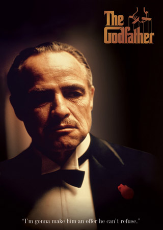
Movie Review: The Godfather

lgpp30555don-vito-corleone-the-godfather-posterLet me start by saying that I have never had the time to watch this movie in its entirety until now, and I can’t believe what I’ve been missing! Different color schemes are used in different parts of the film which I feel indicate moods corresponding to specific points of the movie. For example, in the scene where Sonny, Michael and Tommy, along with their other mob members, are planning the killing of Virgil Sollozzo and Capt. Cluskey, the lighting is brighter as the men converse. However, when the scene finally comes where Michael must follow through with the kill, the lighting becomes very shadowed and dark. The lighting in these scenes show that during the planning phase of the killings, the Corleone household is brightly lit, possibly indicating hope that their plan will work. The lighting darkens when Michael leaves the house to follow through with the kill hinting that he may die or be injured in the task or that the killing may ruin his life and the life of his family all together. Darker lighting indicates uncertainty or sadness throughout the film while brighter lighting indicates a hopefulness that the Corleone’s plans to spark a mob war will work. Brighter lighting is again seen when Michael goes to live in Italy after the Sollozzo killing. While in Italy, Michael is happy, carefree, in love and unaffected by the goings on of the New York mob scene and the lighting and atmosphere is bright and airy to correspond with the character’s current mind set. Back in New York, Don Vito is healing from his multiple gunshot wounds (from his failed assassination by the Sollozzo family), and the atmosphere is dark, shadowy, and gives off a sad/depressed/concerned vibe. This theme of dark and bright lighting is seen throughout the film and I think it works well to set the appropriate moods of the movie.

Colors used throughout this movie seem to be mostly muted grays, blacks, tans, and whites, except when someone is killed. I found that the blood that spatters after any of the killings is very rich and bright in color. This seems to indicate emphasis whenever anyone is murdered and hints at the importance of every person that is murdered by the Corleone family. Color emphasis and contrast can also be seen in the scene where Don Vito is in the tomato patch with his grandson. The tomatoes seemed to stand out in the midst of the green leaves of the stalks and add emphasis to the importance of the scene seeing as this is where the Don dies. As we have discussed, green and red are color compliments because they are on opposite ends of the color wheel. This makes each one stand out more when in the presence in the other. Because this was such an important scene of the film the bright lighting and color compliments make it more memorable in the viewer’s mind.

What really works about this movie is the use of color to indicate Michael’s decent into the mob world. Originally, Michael was never meant to be involved in the family business; he was supposed to be the college graduate/ war hero. During the first scene, the wedding scene, Michael looks happy, fresh faced and clean cut in his army attire but as the movie continues and he becomes more involved in the family business he starts to wear dark colored suits, his hair becomes more slicked back, and his face becomes much more shadowed, dark and worn. The use of shadows also helps to show Michael’s transition into the mob leader.

Overall, the coloring works well throughout the movie, as does the shadowing, and the lighting. There is nothing that I would change about the artistic and photographic elements of this film because anything different would take away the mood and emotion of the movie. This was an excellent film that exemplified many photographic and visual elements discussed in class.

Posted by: mallory527 | March 2, 2009

Movie Poster Review

a-beautiful-mind1I chose to talk about A Beautiful Mind’s movie poster because I think that it exemplifies the concept of emphasis, utilizes different lighting/shadowing techniques, exemplifies color as a theme, and differentiates between a foreground and background.  The concept of emphasis can be seen in the lettering of “A Beautiful Mind” because it is the largest within the whole poster.  Russell Crowe’s name is the second largest lettering which is emphasizing his importance as the leading role in the film and acts as an indicator for potential viewers as to who is in the film. The fact that these letters are white also makes them very prominent in comparison to the colorful backdrop and the brown of Crowe’s suit jacket.      

The second thing I noticed about this poster is that it makes creative use of lighting, especially seen in how the shadows lie across Russell Crowe’s face.  The shadowing hints a certain aspects of the film, mainly how John Nash (Crowe’s character), is plagued by schizophrenia and is caught between different personalities other than himself.  The shadow almost perfectly bisects his face showing a separation, possibly of his thoughts and persona. 

The third thing I noticed about the poster is that there seems to be a bit of a color theme.  Most of the colors are dark and shadowy but a majority of it has a greenish blue tint.  This makes the background, which is blurred, match up with the foreground which is sharp and clear.  This could exemplify how although John Nash has these split personalities and split lives that they are all in fact combined into one person.  A lot of this poster has to do with separations that indicate splits but also indicate commonalities due to the fact that the main character is a schizo.

The final element that I recognized about this poster that has been a point of discussion in class is that of foreground and background.  It is clear that the foreground is sharp and clear while the background is blurred and confusing.  This helps to emphasize the split that already exists in the poster therefore it acts as an emphasis for the theme of the movie (split personalities) as well. The blurred image of the man in the backdrop also forces the viewer to spend more time looking at the poster and attempting to decipher the meaning of the blurred man.

The use of different photographic elements to emphasize and communicate the idea of schizophrenia help to create a unity in the poster.  I think the concept is interesting and well implemented.  


Posted by: mallory527 | February 23, 2009

Title Sequence Review

mike-wisowsky1http://video.google.com/videoplay?docid=2379886950302859702

The title sequence that I chose for this assignment was from the movie Monsters Inc. What I really liked about this sequence was the use of symmetry in the choice of colors throughout the entire clip, the color contrasts and compliments in all of the doors, and especially how the movements during the whole segment correspond to the music.  There is a definite use of color shades and tints, as seen in the first 20 seconds when the blue door is put together.  In the door’s structure there are different shades and tints of blue that give the door a cartoony and realistic look.  Further on in the sequence there is a use of symmetry when the purple doors are lined up on the left side of the screen and the pink are on the right.  This portion also demonstrates asymmetry when the doors are shuffled together because even though they are all the same structure they are of different shapes sizes and color. 

Later on in the clip when the orange, red and yellow doors are shown the use of color compliments is implemented.  I say this because the color red is a compliment of green and seeing as a majority of the doors are red or red-orange in color they compliment the bright green of the monster entering and exiting them (putting more emphasis on him).  Also when talking about the concept of using doors in the sequence it could be said that repetition and theme are being demonstrated. 

Finally, although this sequence uses illustrations that are not quite three dimensional, it still hints at the concept of depth perception.  The one instance that stands out in my mind about this is when a door opens and you only see the opened mouth of a monster.  This demonstrates perception because the lips and teeth of the monster are obviously quite large, but as you see further back into his throat the smaller the circles are the more deep you think the monster’s mouth is (hinting he must be a pretty large monster).  

Overall the sequence is entertaining, exciting for the eyes and makes pretty good use of some photographic and color elements we have discussed in class.

Posted by: mallory527 | February 12, 2009

Art Wolfe: Wildlife Photography

I have always been interested in wildlife photography as well as any type of photography that focuses on capturing the beauty, simplicity, and magnificence of nature.  When looking for a wildlife photographer I discovered Art Wolfe. I found out from his website(see bottom) that Wolfe traveled all over the world photographing subjects ranging from animals to  landscapes to environmental events (such as volcanic eruptions). After viewing a collection of his photos of various landscapes, it was evident that Wolfe has a keen eye for color contrast and complements as well as for creating perspective and symmetry within his works.  What I really liked about Wolfe’s photos is that they all convey a sort of surrealness and calmness.  The coloring in some seems almost artificial because the lighting is absolutely perfect and the hues and shades of the colors are so incredibly varied. What I also liked and admired about Wolfe’s photographs is the patience he must have had to take them.  Snapping a photo of various wild animals and landscapes at such a close range, and still being able to capture a beautiful shot requires a lot of skill and as mentioned, patience.  

 Wolfe’s clear attention to detail to even the smallest flower or cloud adds depth and interest into his photos making each one unique and monumental.  The  lighting in each of the photos is truly amazing as well.  In the photo above of the “Joshua Trees,” Wolfe manages to capture the illuminated purple and orange sky in the background while keeping the trees in a silhouette.  This technique adds to the compelling nature of the photo and actually puts more emphasis on the tree while leaving it colorless (you can see more of the detail of the branches and the shape of the tree itself). In the second photo of the horse there is an intense emphasis on the color contrast of the pure white horse against the ominous blue/gray/black sky.  The white colored horse stands out incredibly against the darker colors of the sky giving the photo an ominous feel to it

When looking at the first photo what really caught my attention was how bright the yellow flowers looked in comparison to the other colors surrounding them.  The purple, blue, and pink in the sky are also very strong however the yellow seems to be the most prominent.  I think this photograph demonstrates the use of color to show harmony, seeing as colors in the landscape match some of the colors in the sunset.  The use of line in this photo is also very unique because it guides the eye to two different points in the photo (the diagonal of the landscape against the mountain and the sky colliding with the tops of the mountains). I was really impressed with the techniques and outcomes of all of Art Wolfe’s photographs and will most likely look to them in the future for inspiration.

http://www.artwolfe.com/index.php

Posted by: mallory527 | February 9, 2009

Photo Review

 n1500029_37099586_9704  This photograph was actually taken by my brother when he was in Colorado for the National Convention.  I’ve loved this picture since the first day he showed it to me due to its simplicity and the way it makes me feel like a tiny ant in comparison to the monumental clouds and endless sand. What works about this photo is the contrast between the muted colors of the white clouds and tan sand against the bright blue sky.  The whole photo gives off a vibe of how insignificant and small we are on this earth and even makes you wonder how something this beautiful could ever come into being.  The simplicity, as mentioned above, is a major reason that this photo works.  I feel if there were mountains or people in the picture it would only take away from the beauty and serenity of the scene.  The cropping of the photograph was also perfect because it captured just enough of the dunes. 

    What I really liked about this photo is how the sand dunes and the clouds collide with one another without the blue sky interfering.  This aspect sort of makes me wonder what is beyond those sand dunes? Is it just vast amounts of more sand? Or a lake? Or even a town?  This colliding of the land and clouds leaves a sense of mystery about the photo and allows the viewer to use their imagination when thinking of what could be beyond the dunes.  What I also liked about the photo is that none of the colors are over-powering any of the others.  There are monochromatic tints of either tan, blue, white, or gray that all seem to add to the majestic nature of the scene. The contrast of the white against the blue adds to the sky’s intensity because it is so blue in comparison to the pure white.  One final thing that I really liked about this photo is that the sun seems to have provided the perfect lighting for the shot.  There is no over exposure, or glare accompaning the scene, just the perfect amount of illumination to give the image a soft, almost heavenly look.

    There is nothing I could change about this photo because if I did it would take away from the natural beauty of the scene.  My brother did say that he took this picture as he was bent over with the camera near his ankles, tilted up, meaning that he must have been shooting from a low angle.  Due to this fact, I may have tried to get even a bit further down to make the dunes appear larger, while keeping the clouds at their intersecting point and leaving more space for the blue sky. However, if I did do this I may risk losing the great effect of the billowing clouds on the sand. The final thing that I noticed is that the dunes are not made to be the focal point of the scene.  There doesn’t seem to be any specific center point of the photo which I think adds to its monumental appearance.

Older Posts »

Categories